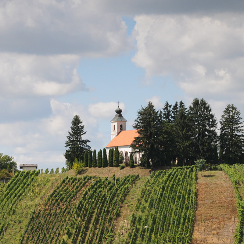
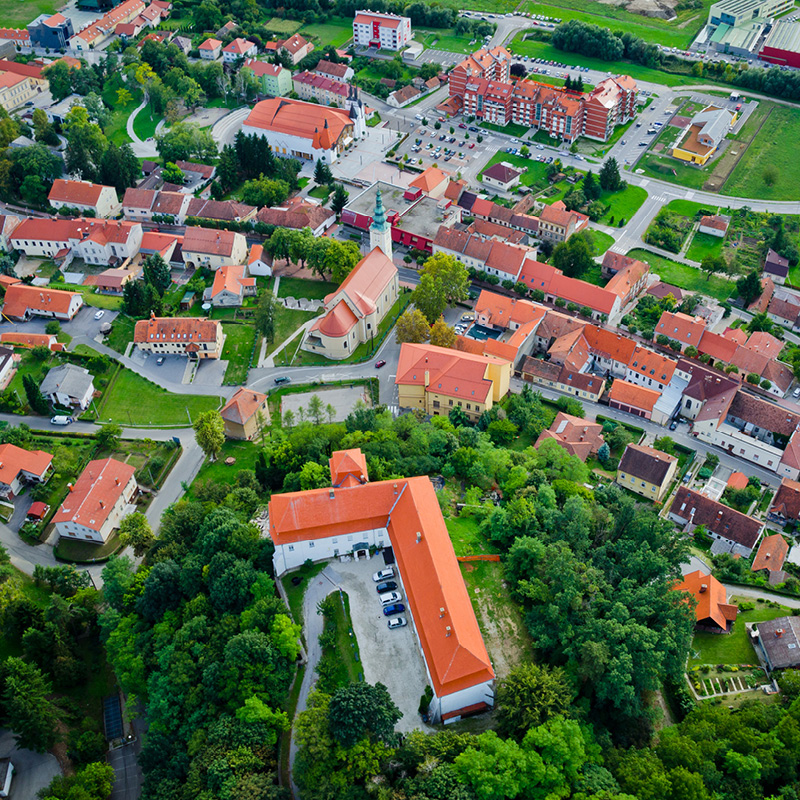
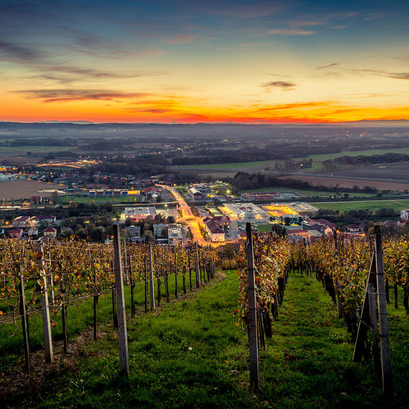
In the heart of vineyards
We CTRL:
CI redesign (SLO and ENG versions)
promo material
Client:
Zavod za turizem Lendava
Dispersed Hotel Vinarium
Razpršeni hotel Vinarium
The Institute for Tourism and Development Lendava launched a project called the Dispersed Hotel Vinarium. It is an innovative form of organization in tourism in terms of a business cooperation of owners or managers of real estate (vineyard cottages) who together manage a dispersed hotel, and thus carry out the activity of renting.
We CTRL:
CI redesign (SLO and ENG versions)
promo material
Client:
Zavod za turizem Lendava

Logo
Green, how I love you, Green
Green color represents the nature, vineyards and hills. The fork shape depicts the vines of the vineyard, the dispersed nature of the hotel (different locations), and the broad offer of the hotel experience: not just accommodation, but also culinary aspect of this kind of vacation. The inscription next to the logo allows representation in different languages.

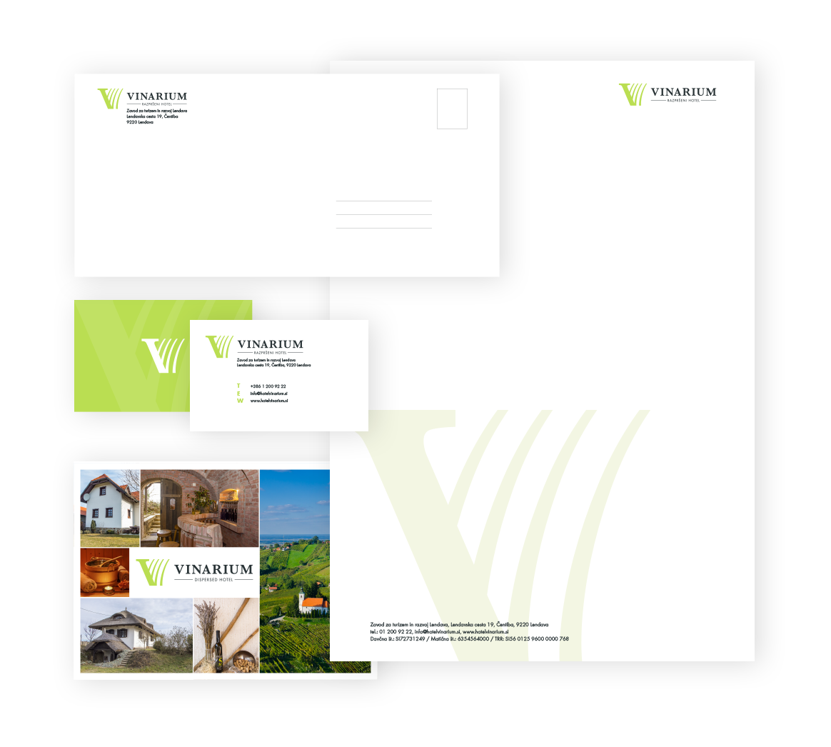

CI
Get lost in the nature
We designed business cards, envelope and correspondence letter. We used the green color of the logo and we added water print to make business documents attractive, yet we still preserved the corporate nature of the documents.
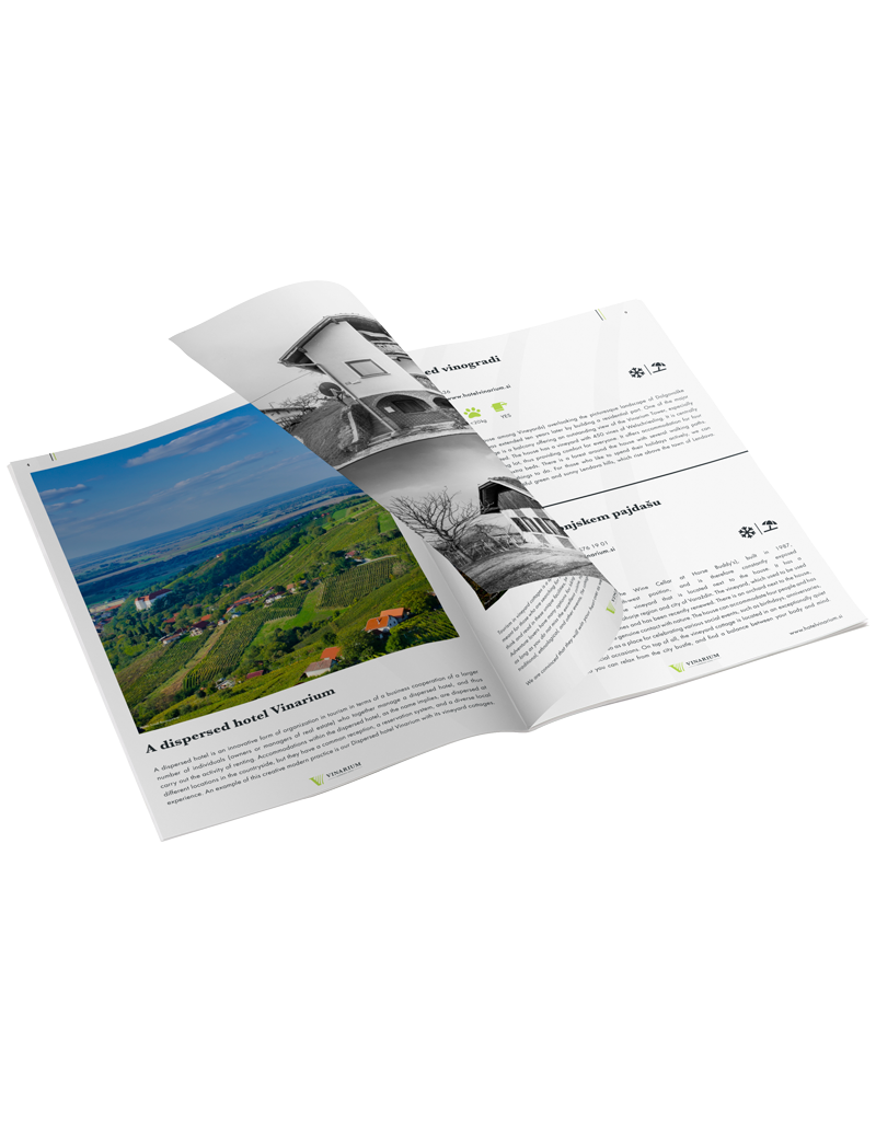

Promo material
We buy with our eyes
We designed eye-catching brochures and postcards to attract customers and to leave an unforgettable impression on them.

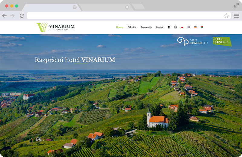

Website
Reserve your dream holidays
Website is clean, attractive and inviting with an overview of all capacities and surrounding offer. We designed an online reservation system designed to allow every customer to quickly and comfortably complete their chosen reservation at any time and from anywhere.
Social media
Spread good vibes
We launched appealing Facebook and Instagram campaigns, in order for brand to become relevant to potential buyers.