The way up is the only right way


We CTRL:
CI redesign (SLO and ENG versions)
promo material
Client:
Slovenski podjetniški sklad
Slovenian Enterprise Fund
Slovenski podjetniški sklad
The Slovenian Enterprise Fund is a public financial institution of the Republic of Slovenia, with the aim of allocating financial support and incentives to the corporate sector in Slovenia.
We CTRL:
CI redesign (SLO and ENG versions)
promo material
Client:
Slovenski podjetniški sklad


Logo change
Design speaks louder than words
It consists of two elements: the graphic symbol and the inscription with the name of the company. Integrated graphic image has a greater visibility and reflects growth, progress, reliability and reputation. It’s simple yet diverse. The line from the bottom right to the left can only mean one – growth equals change. If you want to get better, you have to keep changing and improving.
Slogan change
The price of doing the same old thing is far higher than the price of change
The old slogan indicates doubt, that is why we changed it. Now, it expresses intention, target orientation, efficiency, confidence and a clear vision of the company.


“WE CAN GROW TOGETHER.”
“WE GROW TOGETHER.”
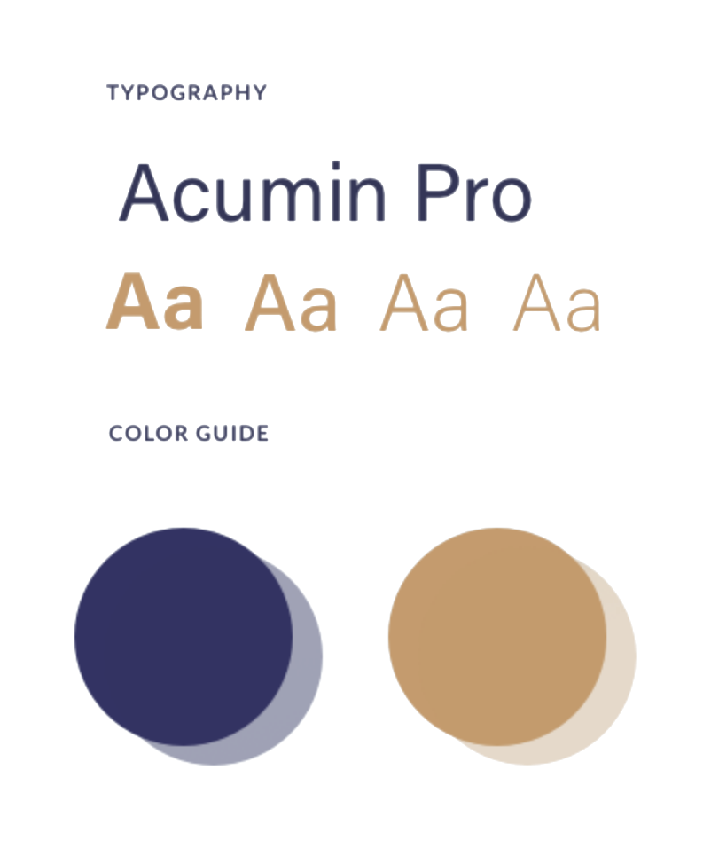
Colors and typography
Good design is good business
We preserved colors, yet we customized shades of primary and secondary colors.
Color environment
"Blue" – reliable, responsible, and shows security and trust.
"Gold" – self-confident, powerful, influential, the color of the winner.
Typographic environment
The primary type is used for text on business papers. Secondary class type is used for internal use,letters, powerpoint presentations etc.


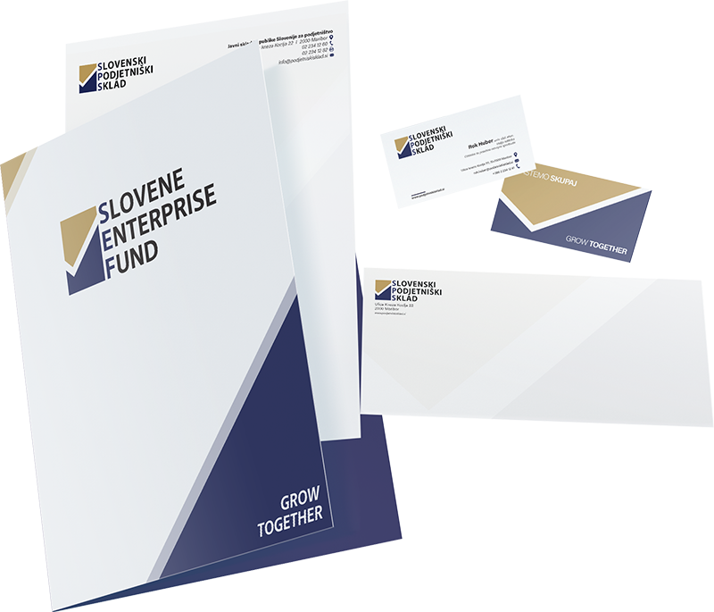

Promo material redesign
CI is the face of a company
It is a financial sector – we chose appropriate “tone” of communication. Financial communication – classic formats – classic layouts.
We redesigned:
- correspondence paper
- business card
- brochures
- envelope
- roll up
- seal
- file